People decide whether they trust your store in about three seconds, before they’ve read a single word. That decision comes almost entirely from how your store looks. Branding is what earns that trust, and it’s the step most new Shopify owners either skip or rush.
If you’re setting up your store for the first time, our How to Set Up a Shopify Store in 2026, guide covers branding as the very first thing to sort out, before you touch Shopify at all. This post goes deeper into getting that piece right.
Key Takeaways
- Lock in your logo, colors, and fonts before you touch your Shopify theme, not after.
- Two brand colors and two fonts are enough. More just creates inconsistency.
- Contrast and mobile legibility matter more than looking clever.
- Your branding has to hold up in email, packaging, and social, not just on your homepage.
- Consistency builds trust faster than creativity does.
What Actually Counts as a Brand Identity?
A logo isn’t a brand identity. It’s one piece of it.
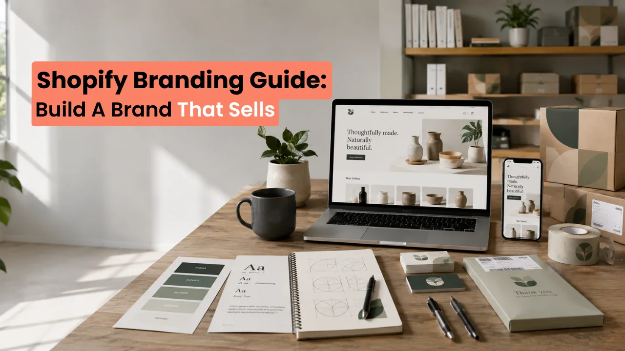
Your full brand identity is five things: your logo, your color palette, your typography (the fonts you use), your imagery style, and your tone of voice. Get all five defined and consistent, and your store looks like a real business from the first click. Skip a few, and it looks like it’s still being built, even after launch.
- Logo: your mark, in a few different formats and layouts
- Color palette: 2 to 4 colors, with exact hex codes saved somewhere
- Typography: 1 to 2 fonts, one for headings and one for body text
- Imagery style: a consistent look for product photos and lifestyle shots
- Voice and tone: how your store sounds in product copy, emails, and social captions
Choosing Your Brand Colors
Start with one primary color. This is the color that shows up most, in your header, your buttons, and your logo. Then pick one accent color, used sparingly, for calls to action like “Add to Cart.” If everything on the page is trying to stand out, nothing does.
- Save your exact hex codes in one document. You’ll need them for your theme, your social profiles, and your packaging.
- Check contrast before you commit. Text on your button color needs to read clearly at a glance. A 4.5:1 contrast ratio against the background is the standard accessibility target.
- Test your colors on a phone screen, not just a monitor. Colors that look fine on a large display can wash out on mobile.
How Many Fonts Should Your Store Use?
Two. One for headings, one for body text.
Pick a heading font with some personality, and pair it with a plain, highly readable font for body text and product descriptions. Avoid script or decorative fonts for anything customers need to actually read, like prices or shipping details. If you can’t read your own font at arm’s length on your phone, your customers can’t either.
Designing Your Logo
Before you brief a designer or open a design tool, have your colors and fonts locked in first. A logo designed before the rest of your identity usually needs revisions once you pick everything else.
You’ll need your logo in a few different formats:
- A transparent PNG or SVG for your website header
- A square, simplified version for your favicon (the tiny icon in a browser tab)
- A horizontal version for email headers and social banners
If you don’t have design experience, briefing a freelance designer with your hex codes and font choices already decided saves both of you time. For a primer on logo design principles before you brief anyone, see logo design basics by Canva.
Applying Your Brand Across the Whole Store
Your homepage isn’t the only place customers see your brand. Consistency across every touchpoint is what actually builds trust.
- Theme: colors and fonts applied in Online Store > Themes > Customize
- Product photography: the same background, lighting, and framing style across every product
- Email templates: your welcome and abandoned cart emails, since these are often the first thing a customer reads closely.
- Social profiles: matching profile pictures, banners, and color use
- Packaging and inserts: if you ship physical products, the unboxing experience should look like it came from the same brand as the website
Consistent branding is also one of the clearest trust signals a first-time visitor picks up on, and trust signals are directly tied to whether they buy.
Common Branding Mistakes to Avoid
- Using more than 2 to 4 colors across the store
- Mixing more than 2 fonts
- A logo that turns into a blob at favicon size (test it small before you finalize it)
- Social profiles that look like a different business than the storefront
- Branding that only got tested on desktop, never mobile
How Long Should Branding Take Before You Launch?
A few days, not weeks. Branding is a step to finish before you build, not a project to perfect indefinitely. If you’re still tweaking your logo a month into building your store, it’s become a way to avoid launching rather than a way to prepare for it.
Frequently Asked Questions
Do I need a professional designer for my Shopify branding?
Not necessarily. Many free Shopify themes work well with a simple, clean logo and a locked-in color palette. A designer helps most with the logo itself, since that’s the hardest piece to get right without design experience.
How many brand colors should a Shopify store use?
Two to four. One primary color, one accent color for calls to action, and optionally one or two supporting neutrals. More than that usually looks inconsistent rather than rich.
Can I change my branding after I launch?
Yes, but it costs you consistency in the short term across your site, packaging, and social channels. It’s far cheaper to get colors and fonts right before launch than to redo them after customers already recognize your current look.
What file format should my Shopify logo be in?
PNG with a transparent background or SVG for your website, plus a simplified square version for your favicon. Keep the original design file too, in case you need to resize or adjust it later.
When It Makes Sense to Get Professional Help
A clean logo and the right hex codes get you most of the way there. Where store owners usually get stuck is applying that identity consistently across a theme, product pages, email templates, and packaging without it looking patched together.
If you want your brand identity built and applied correctly across your entire store from day one, a professional setup service handles that end to end.
Book a Free Shopify Consultation with Logicade
Published by Logicade | Full-Service Digital Marketing and Web Development Agency
If you found this guide useful and want a Shopify store built by specialists who understand both the branding and the conversion optimization that makes stores actually sell, visit our Shopify Store Setup Service or get in touch for a free consultation.